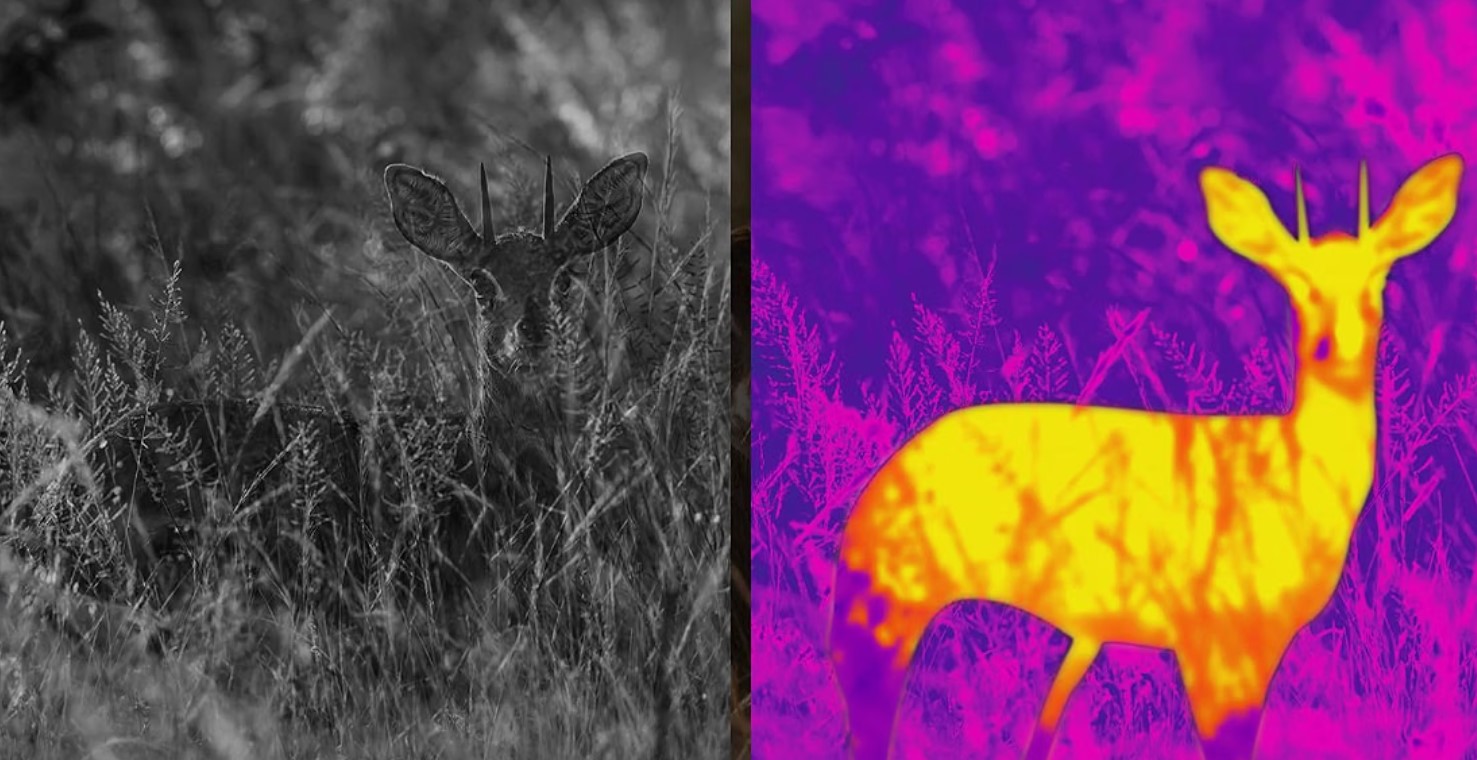
Thermal imaging colour palettes are the display modes that turn a grid of raw temperature data into something your eye can actually interpret quickly, and picking the right one for the situation in front of you makes a genuine difference to how fast you spot and correctly read a target. None of these palettes show true colour the way a normal photograph does. Every single one is a false colour representation, meaning the device is assigning colours or shades to temperature values by a chosen rule rather than capturing anything resembling the actual visible appearance of the scene. Understanding what each palette is doing helps you choose the right one instead of leaving the device on its factory default all the time.
White Hot
The most widely used palette by a clear margin, and usually the factory default. Warmer objects appear light or white, cooler objects appear dark, with a smooth grey scale gradient in between.
White hot works well for general scanning because the human eye is naturally good at picking out bright shapes against a darker background, which is exactly how a warm animal against cool ground presents in this mode. It also tends to render fine detail and texture reasonably well compared with heavily coloured palettes, since grey scale gradients can carry a lot of subtle information.
Black Hot
The direct inverse of white hot. Warmer objects appear dark, cooler objects appear light.
Many experienced users prefer black hot specifically for identification tasks, since a dark shape against a lighter background can be easier for the eye to resolve edges and body outline on, which matters when you are trying to distinguish a coyote from a similarly sized dog. It is largely a matter of personal preference and eye adaptation, and switching between white hot and black hot depending on the scene often reveals detail that one mode alone would miss.
Coloured Palettes
Beyond the two greyscale modes, most modern thermal devices offer one or more coloured palettes, commonly called something like rainbow, ironbow or red hot, though naming varies between manufacturers.
Rainbow or ironbow style palettes map the full temperature range across a spectrum of colours, often running from cool blues and purples through greens and yellows to hot reds and whites. These excel at showing fine temperature gradation, which can help distinguish objects at similar but not identical temperatures, and they are popular in technical and industrial thermal work for exactly that reason.
Red hot palettes render the background in greyscale while highlighting only the warmest objects in the scene in a bright red or orange. This is particularly effective for quickly picking a single warm target out of a visually busy or cluttered scene, since your eye is drawn straight to the colour against an otherwise neutral backdrop.
The tradeoff with coloured palettes generally is that they can be visually busier and slightly more taxing to read quickly during fast scanning compared with a clean greyscale image, though this varies by personal preference and by how cluttered the actual scene is.
Choosing a Palette for the Task
| Task | Palette often preferred |
|---|---|
| General scanning across open ground | White hot |
| Identifying body outline and shape | Black hot |
| Picking a target out of a cluttered scene | Red hot |
| Comparing fine temperature differences | Rainbow or ironbow |
| Low light, minimising eye strain over long sits | White hot or black hot, whichever feels easier |
There is no single correct palette for every situation, and most experienced thermal users switch between two or three modes over the course of an evening depending on terrain, target behaviour and simple personal preference. If your device allows it, cycling through options when you first spot something ambiguous often reveals detail that any single mode would have missed on its own.
Why Palette Choice Never Adds Real Information
This is worth being clear about, because it is easy to assume a fancier looking palette somehow shows you more. It does not. Every palette is applied to exactly the same underlying temperature data captured by the sensor. Changing the palette changes how that data is displayed, not how much of it exists.
What actually determines how much genuine information is available is the sensor’s resolution and its NETD, meaning its sensitivity to small temperature differences. A better sensor gives every palette more to work with. A weaker sensor gives every palette the same limited data, no matter how it is coloured.
Common Mistakes
- Assuming a coloured palette shows more detail than greyscale. All palettes represent the same captured data. A busy coloured display is not inherently more informative than a clean white hot image, and can sometimes be harder to read quickly.
- Sticking to the factory default without trying alternatives. White hot is a sensible default but not universally the best choice for every scenario. Trying black hot on an ambiguous target, in particular, is worth doing before you commit to a shot.
- Expecting palette changes to improve range or sensitivity. They will not, since palette is purely a display choice applied after the sensor has already captured its data.
- Overusing coloured palettes during fast scanning. Many users find greyscale faster to scan across open ground quickly, reserving colour modes for closer inspection of a specific area once something has already caught their attention.
Frequently Asked Questions
What is the best thermal colour palette for hunting?
White hot is the most commonly preferred default for general scanning because bright shapes against a darker background are easy for the eye to pick out quickly. Many hunters switch to black hot specifically when trying to confirm body shape and outline for identification, and to red hot when trying to isolate a target in cluttered terrain. There is no single best choice for every situation.
Does the colour palette affect detection range?
No. Palette is a display setting applied after the sensor has already captured the scene. It changes how the same data is presented to your eye, not how far or how sensitively the sensor can detect a temperature difference in the first place.
Why do some thermal devices only offer white hot and black hot?
Simpler or more budget oriented devices sometimes limit palette options to keep the processing requirements and interface simpler. The two greyscale modes cover the majority of practical use cases, so their absence of extra palettes is a minor limitation for most hunting applications rather than a significant one.
Is rainbow palette useful for hunting?
It can be useful for distinguishing objects at closely similar but not identical temperatures, since the colour spectrum shows finer gradation than greyscale. For fast field scanning many hunters find it visually busier than white hot or black hot, so it tends to see more use as a secondary mode for closer inspection than as a primary scanning setting.
Can I switch palettes while using the device?
On the great majority of modern thermal scopes and monoculars, yes, usually with a single button press or a menu selection, and switching does not interrupt your view or require any recalibration. Trying two or three modes on an ambiguous target before deciding what you are looking at is a genuinely useful habit.
Summary
Thermal colour palettes are false colour display modes applied to the same underlying temperature data, not different levels of captured information. White hot suits general scanning, black hot often helps with identifying shape and outline, red hot helps isolate a target in cluttered terrain, and rainbow or ironbow palettes show fine temperature gradation for closer inspection.
No palette improves range, resolution or sensitivity, since all of that is determined by the sensor before the palette is ever applied. The genuinely useful habit is switching between two or three modes depending on the scene, rather than leaving the device permanently on its factory default.
See Also: Thermal Scope Refresh Rate: 30Hz vs 50Hz

I’m Jake, a dedicated shooter and hunter who has spent years testing rifles, scopes, and gear in the field. I write from real experience, sharing what truly works, not what’s trendy. My goal is to give you honest, practical insights that help you make the right choices for your adventures and pursuits.

